CUSTOM AFTER EFFECTS VIDEO PRODUCTION
Litchfield Distillery
Concept • Storyboard • Animation • Photo Retouching • Video Editing
CHALLENGE: Create a video which features how Litchfield Distillery uses only Connecticut Grown grains. The video was designed to run at tasting events, closed circuit TV within liquor stores, and accessed by a QR code on bottle neck hangers.
SOLUTION: While “Connecticut Grown” is a point of distinction, their connection and place in Connecticut is much larger. The final concept is one that features how Litchfield Distilleries has many sources of pride, including their numerous awards which can help convert customers before they try the spirits.
TESTIMONIAL: “We needed an experienced video editor and creative thinker to help us quickly edit a video for our Litchfield Distillery client. Lothson Design knocked it out of the park. Brian is easy to work with, has exceptional technical skills, along with creative director-level experience. He understood our objectives and delivered a final video that exceeded our expectations. I highly recommend Brian for video and creative services.” – Tony Vengrove, Principal, Miles Finch Innovation
CUSTOM AFTER EFFECTS VIDEO PRODUCTION
Concept • Storyboard • Animation • Illustrations • Writing • Photo Retouching • Video Editing
CHALLENGE: Create custom videos which begin and end with the client’s core capabilities, but each video is customized for a specific audience.
SOLUTION: All videos were created from concept to final edit in After Effects including storyboards, some writing, digital assets created in Illustrator or Photoshop. The Space Case Study was a large hit at a launch party with positive feedback from a White House representative and called “invigorating” by the client.
Thinklogical – Containerization Application Brief
Custom illustrations are animated to educate viewers on a new format for the battlefield.
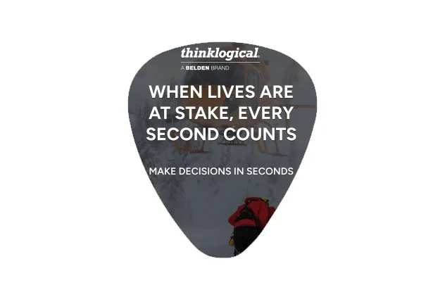
Thinklogical – Maritime Application Brief
Illustrates how Thinklogical’s technology is integral for naval readiness when lives are at stake
Thinklogical – Space Case Study
Demonstrates how Thinklogical's technology is integral at Space ISAC, the world's satellite information sharing and analysis center in Colorado Springs, Colorado
Thinklogical - Multi-Domain Advantages
90second overview of how Thinklogical's technology benefits clients across Land•Sea•Air•Space•Cyber
ICT18 All-In-One
It appears on the website, trade shows, and sales team to quickly illustrate how one new product replaces 18 computers and more.
NE-XT TECHNOLOGIES
Name Creation • Logo Design • Website Design
CHALLENGE: A regional manufacturer is growing and needs a rebrand which not only stands out in the area but can take on new international competition.
SOLUTION: Working as a creative lead with a marketing agency concepted names for the new company which ranged from their skills to their heritage. “NE-XT” was selected not only for its forward thinking but it’s an acronym for New England Expert Technologies. The logo design features original typeface with sharp angles and balance which reinforces the precision nature of their work. Lots of thought and writing went into the website design to ensure NE-XT Technologies had a brand voice that highlighted their expertise and stood out in the market. A range of homepage and supporting page design options were presented for NE-XTusa.com then refined before handing the project off to the marketing agency to complete.
Visit NE-XTusa.com here
THINKLOGICAL, A BELDEN BRAND
Business-To-Business • Trade Shows • Sell Sheets • Social Media • Rebranding • Infographics • Case Studies • Presentations • Videos
CHALLENGE: Create consistent materials that can be modified to fit 3 different customer bases (media, military, emergency services).
SOLUTION: Design and create over 200 (and counting) elements where the look and messaging is engaging, informative and actionable regardless of the customers technical knowledge. Trade show graphics have evolved from stating multiple benefits in many places, to a more simplified and clear messaging. This approach not only cleans up the booth visually, but it lets the video screens and sales people build off the key benefit and engage from there. Printed materials can say more but should do so with clear visual differentiators in color, photography and messaging so each element has a distinct purpose.
FRONTIER COMMUNICATIONS
Brand Development • Business-To-Business • Website • Landing Pages • Digital Ads • Broadcast Commercials • Direct Mail
CHALLENGE: Create branding for a business channel while staying true to the established brand.
SOLUTION: Selected brand mark is upscale and flexible for all platforms and touchpoints. Logos presented ranged from metallic to Americana. All logos feature iconography and do not abandon the built customer equity.
Engaging touchpoints were customized so whether it was a silent digital ad or :30sec television spot, the animated characters and their settings all told the multiple ways Frontier Business Edge will support and grow any size business.
FOUNDATION MEDICINE
Facebook Awareness Campaign
CHALLENGE: Create an awareness campaign for Facebook which engages a select audience on a sensitive subject matter –– advanced cancer testing.
SOLUTION: Dozens of original approaches were concepted, written and designed. Five animations or carousels were chosen which tackle education and engagement in a variety of ways: awareness (1 in 3 may face cancer), ask a doctor (3 questions), information (a detailed CDx report), benefits (6 reasons to take the test), options (know the test is an option).
The successful campaign garnered over 3,000 likes, 1,000 shares, 500 saves and over 500 comments from love to cry.
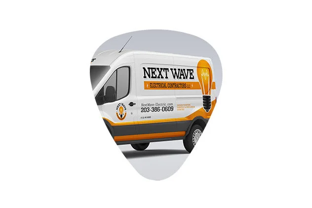
NEXTWAVE ELECTRICAL CONTRACTORS
Small Business Rebranding
CHALLENGE: As with many small businesses to save money the owner of NextWave used a discount web service to design his previous logo and designed his website online by himself. Though they were “o.k.” the owner felt the look never truly reflected his business or helped NextWave stand out from its competitors.
SOLUTION: For the branding, create a logo that is traditional yet modern and instantly recognizable as electricians. A classic incandescent light bulb was personalized with waves between two very subtle drumsticks (a nod to the owner who is in a band). For the website, replace the previous stock-photography-heavy approach with a clean one-page design. Clearly designate between commercial and residential customers with an engaging list of services, quick testimonials and samples of their work.
View Website
FRED'S ENERGY
Brand Building • Website • Outdoor Presence
CHALLENGE: Refresh and update the look and feel of medium-sized company which had outgrown its humble beginnings.
SOLUTION: A modern and fresh approach. The tagline speaks to Fred's local community roots, while combatting their competitor's reliability and price issues.
Gault Stone • Townsend Energy • Nice Car • Gault Energy • Federal Energy • Boyle’s Energy
CHALLENGE: The age-old challenge that direct mail has a low response rate.
SOLUTION: Catch attention with positive, relatable and aspirational photography where appropriate. Balance with approachable language that motivates the customer.
Package Design • Consumer Promotion
CHALLENGE: Partner with Warner Brothers to promote Superman Returns for a first-of-its-kind promotion involving Quaker and Tropicana products.
SOLUTION: A national online promotion of “Find Superman and Win” worked across all brands using a code from packaging for a randomly timed sweepstakes. To go beyond a limited time packaging redesign the Superman property was used in a unique way for each of the five brands and 25 SKUs involved. For Superman Crunch Cereal, Superman and the Cap’n work together to save Metropolis from a meteor. Life Cereal featured an exclusive character match game on the back, perfect for their young audience. Rice-a-Roni had a Superman trivia game a parent and child could solve together while the product cooks. Among concepts on the cutting-room floor, one was to give one of Superman’s unique superpowers to each of the brands (i.e., Superman’s cold breath would be on Tropicana packaging and an exclusive 3D Superman Shield would be under the cap).
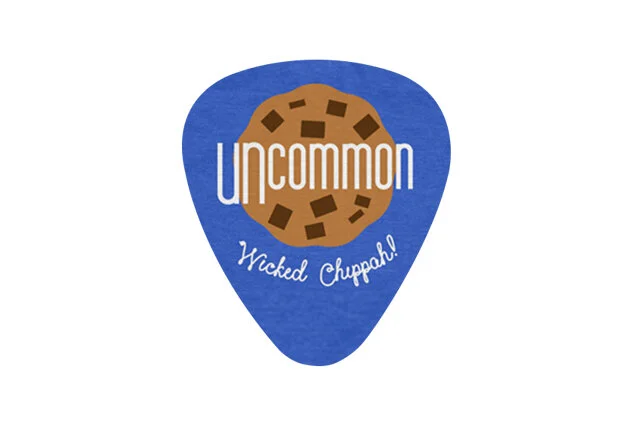
small business brand identity
COOKIEUNCOMMON: A regional gourmet bakery needed a brand identity that, like its recipe, is traditional yet fresh. The logo was designed to be extremely versatile in all sizes whether stacked or, in the case of Instagram, where the iconography does the heavy lifting.
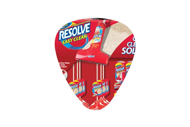
RESOLVE
In-Store Display • Category Shelf Design • Education
CHALLENGE: Educate and elevate shelfsets in major supermarket and retail chains.
RESOLVE: These displays served as a launch of a new product while educating about the method that is new to the category. The messaging for each approach varied (product/how used/brand reinforcement) and gave the client the option as to which message they wanted to hit home. The displays ranged in production from low-to-high end to allow the client tobreakdown between high and medium traffic stores.
VARIOUS COMPANIES AND BUSINESSES
CHALLENGE: The common goal – create a unique logomark that, stands out from competitors while being true to the brand.
SOLUTION: Unique solutions which are distinctive to the client’s industry, personality and heritage.
PepsiCo • Frito-Lay • AOL •Post Cereals • Lufthansa • Gault Stone
CHALLENGE: Common goal – to capture the viewer and show the product/service/company in a fresh light.
SOLUTION: Engaging copy and eye-catching visuals to fit the audience.
ANGUS ENERGY
Brand Building • Business-To-Business
CHALLENGE: Refresh an established energy leader’s brand and unify all divisions and products.
SOLUTION: While using the previous color pallet the Angus Energy logo was refreshed to be more modern and adaptable to the supporting divisions. The division names were changed to be one word for simplicity, and the letters could be interchangeable under the Angus umbrella. Each division had its own color so it had its own equity within the masterbrand logo. A new tagline was created to combine the power of the divisions, which helps cross sell capabilities. BRITE, a product of Angus Analytics, had its logo, website and how-to video refreshed.