• Creative solutions. Sharp design. •

ANGUS ENERGY
Brand Building • Business-To-Business
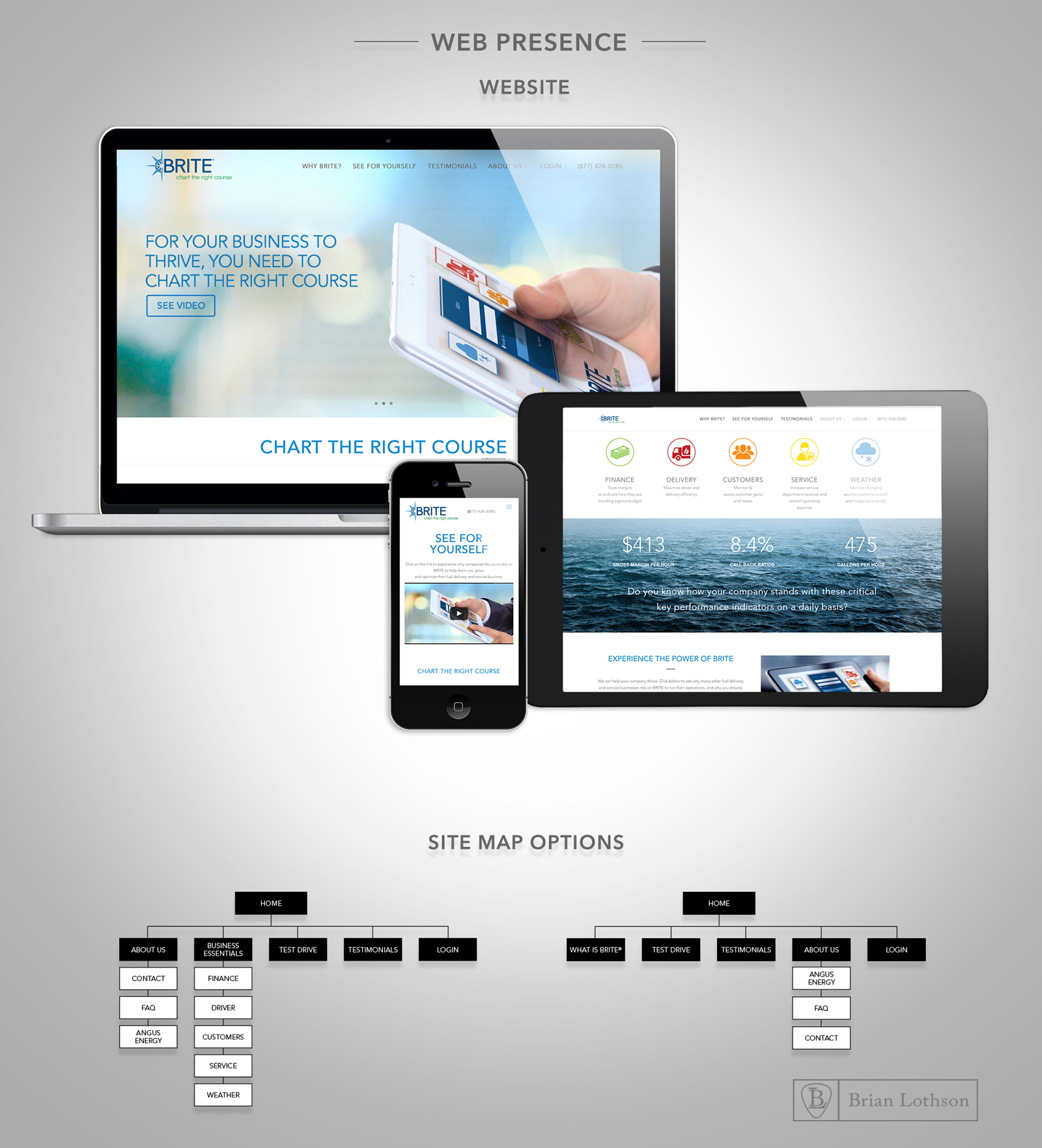
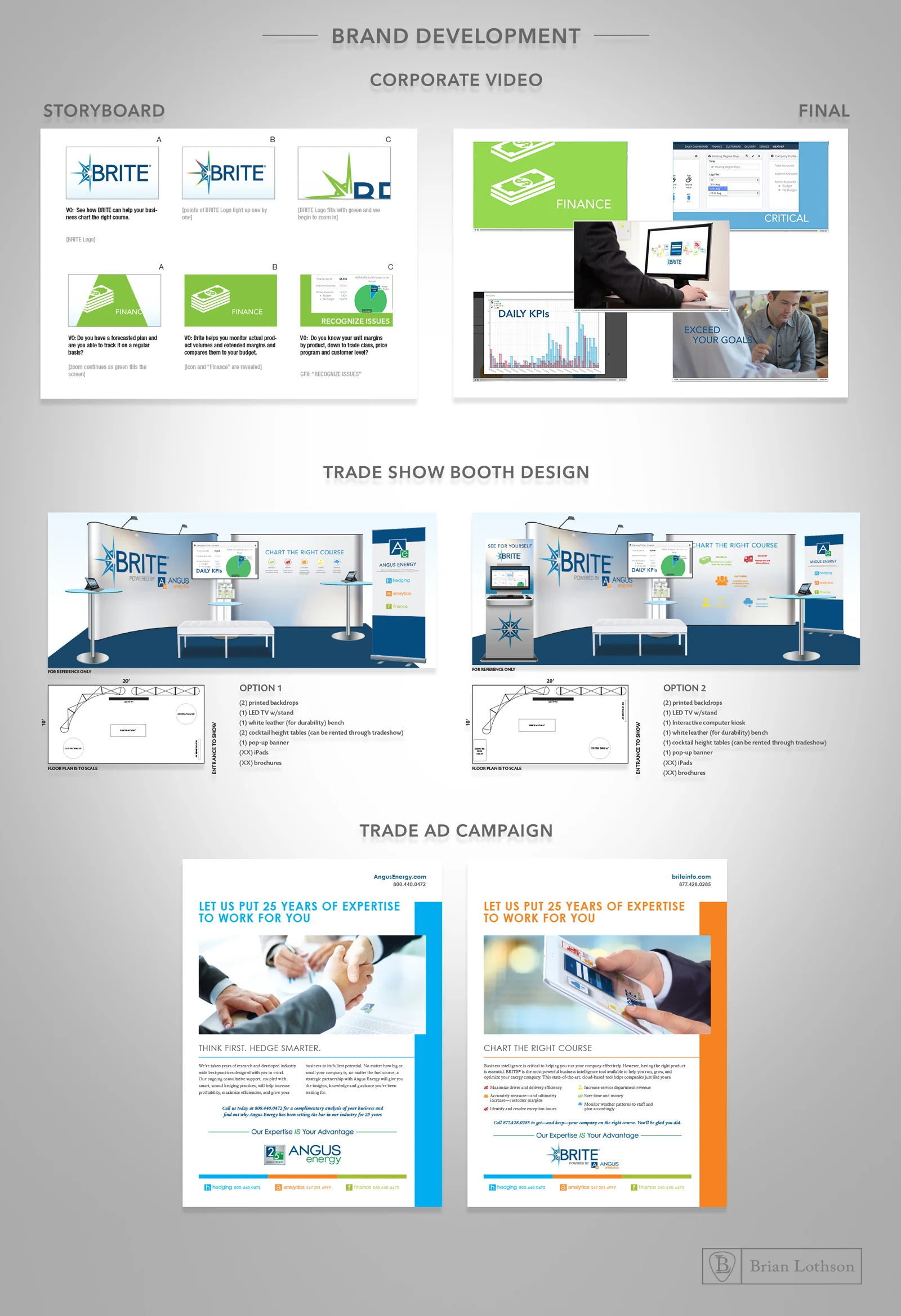
CHALLENGE: Refresh an established energy leader’s brand and unify all divisions and products.
SOLUTION: While using the previous color pallet the Angus Energy logo was refreshed to be more modern and adaptable to the supporting divisions. The division names were changed to be one word for simplicity, and the letters could be interchangeable under the Angus umbrella. Each division had its own color so it had its own equity within the masterbrand logo. A new tagline was created to combine the power of the divisions, which helps cross sell capabilities. BRITE, a product of Angus Analytics, had its logo, website and how-to video refreshed.